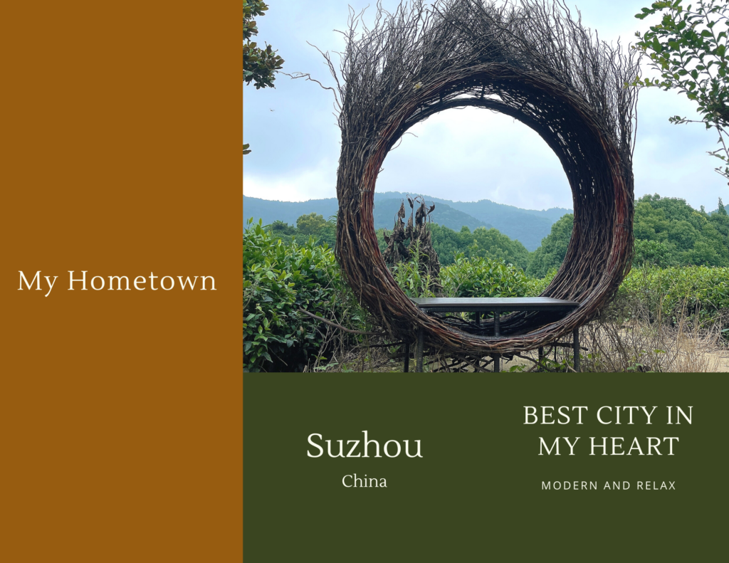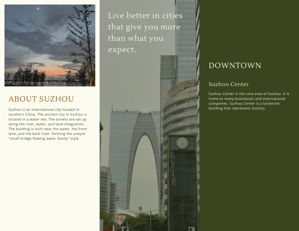

This week I learned how to design and layout through Canva. Infographics are a way to combine complexity and information in a clear and concise format. The graphic format makes it easier for us to receive the most critical information. Canva is one tool for creating infographics, Resume, Brochure, Poster, and so on. I think Canva is a functional site. One feature that I find very efficient is that he automatically identifies the center based on the text or the image. It will make our posters look more neat and unified. What’s more interesting is that we can use its library of images, elements, and colors in the process of making it. We can use the images that come with it and the images that we want to use. In elements, for example, we can quickly enter the element name in the search bar, then it provides a lot of material in different styles and colors. Of course, to unify the overall tone, we can also use the color function to replace the same color as the theme without a complicated search. I find this feature saves a lot of time, and I find the instructions easy to follow. We can choose different file types to save, such as PNG, PDF, JPG, and even MP4 video or GIF when downloading. I think Canva is an excellent tool to help us not only in study but also in work.
Hi, jing jing ☺️
Thank you very much for your sharing this week. You have created a poster related to your hometown through conva. This online software includes beautiful pictures and corresponding introductory content, and through excellent colour matching, I think it is very attractive to readers. In our daily life, we can see different kinds of posters everywhere, whether we study or work, even on campus, in restaurants, and even at bus stops. In the process of making posters, we need to grasp the focus so that readers can understand the main content of your poster and want to promote the content. Hence, it would be best if you introduced the need to promote the content. If only a lot of text, reading will be rather dull. It is difficult to grasp the focus, but after adding relevant pictures, it will be very attractive, so that the whole poster I think will be very helpful for our future study of social media.
Hi Jialin,
Thank you for liking my blog.
Jingjing